"Gallery of Enchantment" is a cyber-gallery we've specially created to showcase some of our students' art pieces. We want the kids to be proud of their creation, proud to showcase their TALENT to their parents, friends and the world. Do enjoy their masterpieces through the viewing of our "ENCHANTED GALLERIES"...
Friday, 30 November 2007
DARRYL - "Pop-Up" Lion King!
Wednesday, 28 November 2007
YEETONG - City in Frames

This is a 'Comic' Style drawing frame which we wanted the kids to create a city of their own within these frames
Few objectives to be delivered in this lesson
1) Learn how to draw 3-dimensional objects
2) Learn how to draw things in perspective (ie objects in front will be bigger...far away will be smaller)
3) Learn "Overlapping" drawing
4) Learn to draw details
5) Learn how to see things in "Separation"
To guide the kids along, a handout with shapes in 2D & 3D drawing were given to them as reference. Photos of city skyscraper were also provided to help them expand their creative mind. So far so good. The kids have managed it well :)
YEETONG - My Slippers "Footprint Round the World"

One Size doesn't Fit All! Rule of Game is to be able to... CUSTOMISE!
This is an exercise for the younger students. We have a standard Slippers Template which we want the kids to trace the shape onto their drawing paper. With all having the same slippers outline, they are required to become a 'designer', designing their own pair of slippers, giving it a different background
What did they come out with?... Yes! Slippers on sandy beach...on deep blue sea...on shallow river...on green grass patch...in jungle... Hahaha...They can be really creative man
What we want to achieve in this lesson is to let the kids' creative juices flow naturally. With limited guidelines given, the kids will have to learn to make their own decision and cope with "flexibility"
Some might say..."Isn't it easier for the kids if more flexibility were given to them?" You will be surprised man. Young kids will feel 'lost' if too many choices were given to them. They are used to receiving specific instruction to execute jobs given to them. They need to learn to move out from this 'box'! This is part of their learning process
YEETONG - Still Life Drawing (2-Dimensional)

In this session, we are teaching the kids "Still Life" drawing.
For the older kids, they are required to draw by observing REAL objects placed in front of them. We reckon this will be too challenging for the younger kids, hence the requirement for the younger students is to draw using a stack of picture cards as their reference source
Above is an example of what needs to be delivered by the younger kids. The main objective is for them to learn observating 2-dimensional subject, put what they see on paper and learn 'Overlapping' drawing. This is also an opportunity for us to introduce 'toning' effects to them. They will learn how to make use of different colour tone to create more dimensional images
Tuesday, 27 November 2007
ELTON - Shark Attack! Popped up

Love the way Elton has done his "Shark Attack!" popped up. The angle of the shark, showing its fin from front view! Cool isn't it?
In fact, the front cover of Elton's pop up shows a couple fishing on a small boat. A string was pasted on card, connecting to one of the fishing rod This gives a little surprise element - Calmness above water with the hidden underneath danger! I like this creation! :)
Monday, 26 November 2007
Carmen - Popped Up Penguin


Great ideas developed from Carmen's creation!
1) Reversable Popped Up
- Carmen's intention is to create a Penguin popped up. Somehow, when we placed the popped up upside-down, the visual turned into a BULL! Cool creation man. Never expect this could be seen in two dimension :)
2) Letter Holder?
- Carmen wanted to create a 'fish' for her penguin and 'grass' for her bull. When the additional piece was placed in the popped up opening...hey, we can place the popped up card in the house, serving as a 'Letterholder' :)
Great creation Carmen! :)
Saturday, 17 November 2007
JEMIMA - Printing Board


Medium: Foam Board + Printing Poster Paint
Date of Creation: 17 Nov 2007
I like Jemima's idea of creating "Mummies" comic strip. The lines from the "Mummies" visual has made the overall feel simply GREAT! Neat lines created, delivering clarity in the work she has done. Jemima is careful in her work so no 'dirty patches' created on any of her work when printing. Well done Jemima!
NICHOLAS - Printing Comic Board


Medium: Foam Board + Printing Poster Paint
Date of Creation: 17 Nov 2007
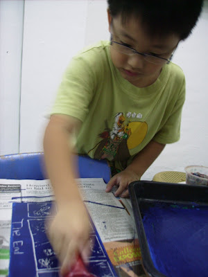
Nicholas attempted to create a comic strip template for printing. Very neat work done and he has really put in lots of effort to get it into the right format. Although he has made a mistake in reversing the direction of wording 'THE END', this somehow created some 'uniqueness' in his work in comic context. Important thing is that Nicholas has learned from his 'oversight' so next time he will remember that printing board will always take a reverse direction. This is also a way to teach the kids to see things in different perspectives. Good attempt Nicholas!
Subscribe to:
Posts (Atom)


